

Alight 004 ✧ Composition and 'The Rules'
Alight 004 ✧ Composition and 'The Rules'
Making small changes for bigger visual impacts
Hi friends!
This week’s edition of ALIGHT is a little bit more practical than the last, discussing a topic that’s easy to pick up, but hard to master — composition in photography. Despite its reputation of being a meaningless buzzword to reference when you’re trying to seem interested in a photo, when you know what it is (and how to play with it), it becomes a bedrock of your practice.
As always, if you think this topic would be interesting to someone you know, feel free to share this newsletter with the cool people in your life.

The Rule of Thirds
In the simplest terms, the rule of thirds involves aligning your areas of interest into the zones of a picture that will have the most visual impact. This compositional rule is not only universally used across all artistic mediums, but it’s also likely that we are drawn to it because it mimics natural mathematical laws.
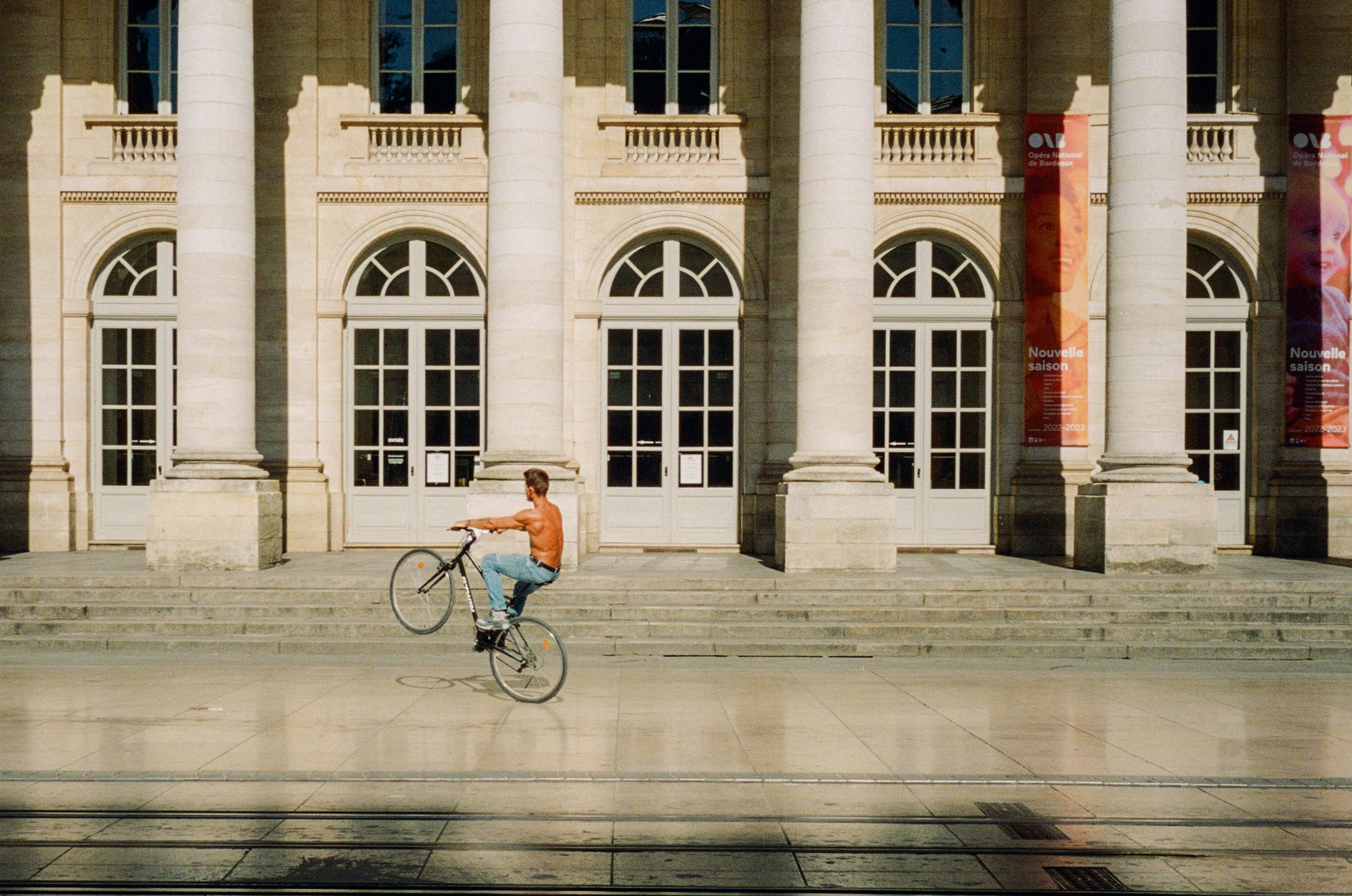
It might be more familiar to picture the rule of thirds as a grid over the top of a photo that separates it into 9 equal parts. The four internal corners where the lines of the grid intersect are the points of a scene where our eyes naturally like to fall. Here, lemme show you (it’s a photography newsletter after all):

On the right, I’ve overlayed the grid that I’d encourage you to imagine every time that you bring your eye up to your camera. You can see that each element falls into place along one of the key lines, and my subject in placed in the impact area where two lines intersect. The columns even follow the vertical line upwards on the right, and the doors don’t go above the upper horizontal line into a new area of the box. Try to imagine the same kind of grid over top of the images below, and note where the elements of interest are placed.

Practicing this kind of structure can really help you make good, quick decisions about what should or shouldn’t be in your photo when you’re presented with a scene. You could think of it as a limitation, but a lot of people like to think of it as a way to exclude a lot of less desirable options, and hone in on the good ones. It’s like re-watching The Office for the 18th time; at least you don’t have to waste time finding something new that might be bad.
Leading Lines
I feel like the way we tend to think about leading lines is a lot less exciting than they actually can be when we execute them well. All the image examples online about ‘leading lines’ look pretty much like this —

Alright, don’t get me wrong - it’s nice. It’s fine. Pretty things are pretty. It’s satisfying, in the way a chocolate chip cookie would be — common, ubiquitous, familiar. I don’t know about you, but I like weirder cookies, the ‘ginger and roasted pistachios’ types of the world.
Leading lines can dance your eyes around an image in a cycle, trying to show you something new each time. Let’s take a look at an overlay again, and examine it.

Here’s how I experienced the lines in the example above:
The sweeping staircase and the lines going upwards on the signs to the right bring my eye to the pattern on the wall.
Downward lines created by the yellow awning brings my eye to the couple.
Shadows on the ground bring me back to the signs, where the cycle repeats itself.
When I’m seeking inspiration from other photographers, how they control and capture lines (consciously or not) is one of the main aspects I try to understand — what is it that they’re trying to direct my attention to, and how does it tell a cohesive story? Do I enjoy following the lines? Is it rewarding?

That’s it for this week, folks! Next issue, I’ll explore the topic of contrast, because it’s one of the things that I’m actively trying to get better at by learning from other photographers. I’ll share a few images from others’ work that I admire, and how I’ve changed my practice because of them.
Don’t forget to subscribe, if you haven’t already, and let me know if there are any big topics you’d like me to tackle in the future!